EngageNext
A Check-In Experience at Dealership Service Lane

Project Information
A re-design project for an entire enterprise-level tablet check-in App
Timeline
1.3 Years
(March 2018 - June 2019)
My Role
Lead Product Designer
Every step from product research to visual design
Team: 2 UX Designers, 1 PM, 30 ENG
What is the problem?
- Redesign the check-in experience
Product Focus
The check-in experience at car dealership service lane between service advisors and vehicle owners
Target Users
-
Service Advisors
-
Vehicle Owners (when sharing the tablet)

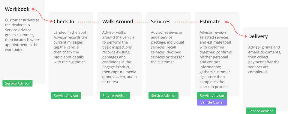
User Journey
What are the goals?
Business Objectives
-
Increase product utilizations
-
Reduce average appointment check-in time
-
Increase sales per check-in
-
Optimize current IA, workflows, and UI to provide a better user experience
Success Metrics
🌟 Advisor utilization
🌟 Average check-in time
🌟 Sales per check-in
🌟 Adoption rate
Design Goals

What are the results?
👻 Psst! If you are looking for "my process", click here 🕹
Metrics - As of May 2019, after 6 months of the pilot release

User Feedback in a nutshell
Our support agent told the users to go back to use the old version (Engage7) if they were having issues with the new version. Here is what they said:

Other feedback

Redesigned Experience - New vs Old
Workbook
NEW

Layout, view and scroll treatment

Date picking

Appointment status filter

Layout, view and scroll treatment
OLD

Layout, view and scroll treatment

Layout, view and scroll treatment

Appointment status filter

Layout, view and scroll treatment
Search & Add Walk-ins
NEW

Search or Add Walk-ins

First to search today's appointments

Search OEM database

Search or Add Walk-ins
OLD

Search

First to search today's appointments

To add walk-ins, search customer record to begin with

Search
Check In
NEW
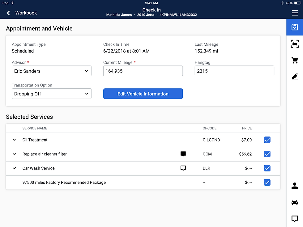
Check In Tab - one page solution

Customer Info page becomes a stand-alone tab on the side navigation. It can be accessed from any step within the check-in process, which provides a more flexible workflow.

Check In Tab - one page solution
OLD

3 Sub-tabs under Check In: (1) Appointment

3 Sub-tabs under Check In: (2) Customer info

3 Sub-tabs under Check In: (3) Transportation Options

3 Sub-tabs under Check In: (1) Appointment
Walk Around
NEW

Walk Around Tab - one page solution, upfront media capture and media review

Media Capture - photo

Media Review - audio

Walk Around Tab - one page solution, upfront media capture and media review
OLD

2 Sub-tabs under Walk Around: (1) Condition

2 Sub-tabs under Walk Around: (2) Inspection

Media Review: no thumbnail review, hard to tell different media types apart

2 Sub-tabs under Walk Around: (1) Condition
Services
NEW
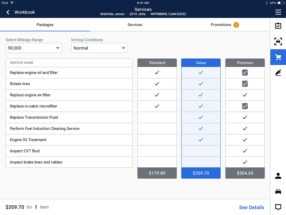
Package subtab - Select service package

Services subtab - a true "All Service" tab comparing to the old version

Promotions subtab - indicator on the tab navigation bar, straightforward promotion name comparing to the old version

Package subtab - Select service package
OLD

Package subtab - Select service package

All Services subtab - not really contains "all services", but really just a la carte services (individual services)

Promotions subtab - display promotion campaign name, expand row to see what promotion it actually is

Package subtab - Select service package
Estimate
NEW

Tasks handled in Estimate Tab got broke down into 3 distinguish steps - Step 1 Review Services and Estimate

Tasks handled in Estimate Tab got broke down into 3 distinguish steps - Step 2 Review Customer Information

Appointment Checked In. Documents are emailed to the vehicle owner and printed to the default printer automatically. Also, email or print additional documents manually is allowed.

Tasks handled in Estimate Tab got broke down into 3 distinguish steps - Step 1 Review Services and Estimate
OLD

Estimate Tab: Review selected services, estimates, and customer information. Manually select documents to email and/or print after check-in

Once approved the estimate, set promise time, appointment update settings and collect customer signature

At this point, the appointment is actually checked in. Previously selected documents will be printed one by one until finished, and user will be taken back to the workbook.

Estimate Tab: Review selected services, estimates, and customer information. Manually select documents to email and/or print after check-in
Delivery
NEW

Delivery Tab handles the "Post check-in experience" - either it's right after check-in or when the appointment is done. Documents subtab - Email/Print documents.

Payment subtab - Allow customers to pay now with CenPos (third party app), or pay later through a microsite

Request Rideshare full page modal - integrated with rideshare services to allow the dealership to call a ride for the customer on their expense

Delivery Tab handles the "Post check-in experience" - either it's right after check-in or when the appointment is done. Documents subtab - Email/Print documents.
OLD

Delivery tab - only allow payment (now/later)

Delivery tab - only allow payment (now/later)
What is the process?
UX Process Overview

Planning
Internal stakeholder interviews to...
teams we interviewed:
-
Gather requirements and constraints
-
Define project scope, goals and vision
-
Come up with project plan and launching strategy
-
Engineering
-
Product
-
Marketing
-
Design System
-
Performance Management and Readiness
Current product feature audit and journey & clickthrough map


Key Outcomes
What’s the vision and strategy?
-
Good customer experience first, “up-sell” second -- a better consumer experience, and help our dealership users to educate vehicle owners and sell more services
-
EngageNext must be scalable -- within Xtime product suite and to other Cox business units
-
EngageNext becomes THE advisor tool -- handle advisors day-to-day tasks in one platform
What are the goals and success metrics?
-
Increase product utilizations
-
Reduce average appointment check-in time
-
Increase sales per check-in
-
Optimize current IA, workflows, and UI to provide a better user experience
🌟 Advisor utilization
🌟 Average check-in time
🌟 Sales per check-in
🌟 Adoption rate
What is the overall plan?
-
Pilot release
-
No change in the backend, no new functionalities
-
Better workflow, IA, look and feel, etc
-
Analytics implementation: Need to be fully tagged
-
-
After Pilot before GA
-
Collect feedback through analytics and users, and iterate
-
Fix bugs
-
Build new features
-
How will UX team cooperate with other teams?
-
w/ Product team: sync often, work together to define IA and workflows
-
w/ Engineering team: involve ENG leads early at lo-fi wireframe stage and forward
-
w/ Design System team: [context: a WIP design system - no mobile design patterns defined, desktop patterns are being defined] our working agreement: Review design explorations with them often to ensure we are adhering to the existing patterns while also helping to grow the design system, and define the patterns that demand further explorations.
Research
Qualitative Research: conducted 20+ interviews and 10+ contextual inquiries with customers & users to…
-
Understand and observe how they actually use the current product
-
Discover pain points
-
Listen to their asks
-
Look for new potentials and opportunities
Quantitative Research: We also looked at tons of Google Analytics data to…
-
Identify the most and least utilized areas/functions to determine the redesign focuses
-
Better understand user behaviors through data
What do our customers and users want with EngageNext?
A: See improvements on lane efficiency and advisor accountability,
which coincides with the CSI score of the dealership
Key Insights
Then, how should we help them to get there?
1
Better Engagement - “The more you engage with the customer (vehicle owner), the better off you are”
-
EngageNext should empower advisors to be better at what they do
-
Know what the vehicle owner is coming in for
-
Know what has been done with their vehicles
-
Know what is coming up
-
Help the vehicle owners to be in a better situation by suggesting services based on expertise and inspections without coming across as “up-sell”
-
-
EngageNext should accommodate both advisors’ and vehicle owners’ experience when sharing the tablet screens
2
Better Workflows
-
EngageNext should provide workflows that are both focused and flexible to help advisors to focus on their tasks without distraction, while also accommodate their different workings styles.
-
EngageNext should automate applicable workflows to increase efficiency
Better Performance
EngageNext should implement the newest technologies and tools to provide a steady performance to upgrade advisors’ “game”
3
4
Better Integrations
EngageNext should have better integrations with other Xtime products and DMS (Dealership Management System)
Low/No Learning Curve
5
EngageNext should be self-explanatory and require no training and ramp-up time to adopt
What are the areas that need to be improved?
-
Walk Around Tab media capture and attachment flow
-
Workbook and filters to help better focus on their job
-
Transportation Option Tab - position in the check-in flow
-
Customer info Tab - position in the check-in flow
-
Service Tab – more focused, and better assist “up-sell”
-
Estimate Tab – guided flow to help navigate and focus on each important tasks
-
Document printing and emailing – automated flow and sticky preference
-
New customer walk-in flow - easier and more straightforward workflow, and better integrations with OEM
Selected Problem
Redesign The Walk Around Inspection Experience
The Context
As a mandatory step by the dealership, Service Advisors use the “Walk-Around Tab” to perform the basic inspections around the vehicle and capture media to document vehicle conditions for liability purposes.
Problems with the old experience (E7)
It took 3-4 taps to just take one photo. Service Advisors are required to take at lease 4 photos per check-in,
most take 10+ photos based on our interviews, observations and analytics data
So, that’s at least 30-40 taps to just finish the photo capture.

“Though it is required (by my boss), I barely use the functions in walk-around, it's just taking too long. To keep my customers (in-lane & waiting) happy,
I need to do check-in fast, and can’t waste time”
💔 Photo Capture: 3-4 taps to take only 1 photo
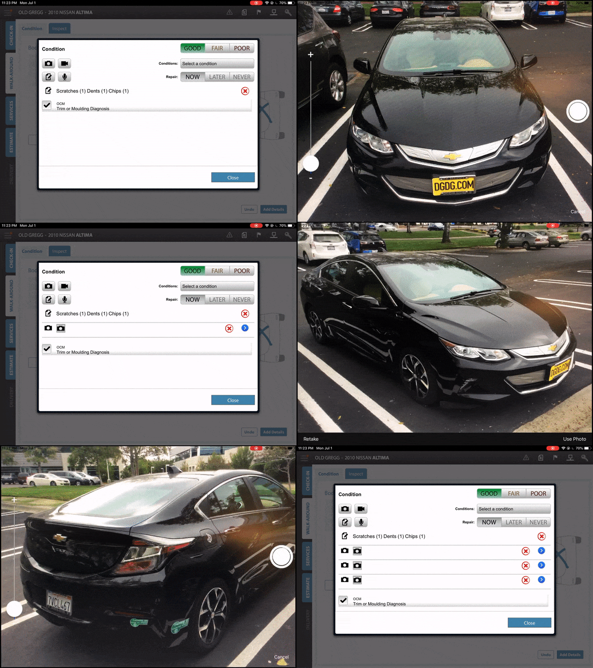
💔 Media Preview: close to none

💔 Audio Capture: change orientation

🤔 Layout: High usage on one, low on the other


How to make it better?
Improve efficiency! In more detail...
1
Better page layout and information architecture
2
Better media capture, preview and attachment experience
Ideation & Conceptualization
The big picture - First of all, we explored the Page Layout and Information Architecture
Version 1


Version 2

🏆
Version 3 - Winner


Early Idea Verification & User Testing
To verify if we are on the right track, we created a Low-Fi InVision Prototype. Then we reviewed with internal stakeholders and tested with dealership end-users.

Hi-Fi Wireframe Level Explorations
So, the “stacking layout” has been given the green light. We then started to explore each section in depth.

Explorations: Flat Car Area & Media Capture and Attachment


Explorations: Inspection Items


Explorations: Photo Capture, Preview and Review


(flowchart)
Explorations: Video Capture, Preview and Playback


(flowchart)
Explorations: Audio Capture, Preview and Playback


(flowchart)

Final Design Deliverable (& Improvements Highlight)
Walk Around Tab

-
A more focused workflow: One-page layout with emphasis on the high usage functions
-
Accessible & Upfront: One tap away for all media capture functions
-
Clear and grouped media previews
Photo Capture, Preview and Review


-
Continuous photo capture: brought down taps from 3-4 to 1 per photo capture
-
Easy to navigate photo preview/review
Video Capture, Preview and Playback


-
Clear distinction between previews: different shapes between video and photo preview thumbnails
-
Chunky UI for target users: most of the service advisors have big hands
Audio Capture, Preview and Playback


-
UI orientation remains: users don't have to rotate tablet anymore
-
Motion graphics based on volume: provide instant feedback
-
Design consistency: same playback UI component is shared between video and audio


